

Interaction of colour:
Campaign for Ariashop.co.uk
The Brief:
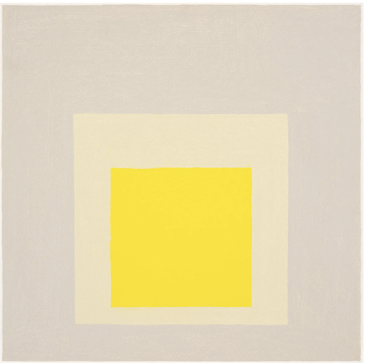
To launch Aria’s new “filter by colour” tool, we created a content-led marketing campaign designed to drive engagement and generate leads across both existing and new audiences. Inspired by Josef Albers’ Interaction of Colour, the campaign explored the role of colour in interiors, turning a functional website feature into a compelling editorial story. The campaign delivered 250k sessions in website traffic, and drove 85% growth in new users, demonstrating the power of content to introduce audiences to a new product experience.

Format & Results:
-
We extended the colour narrative into a targeted email marketing campaign, creating a series of curated newsletters organised by colour. Each edition brought together furniture, lighting and editorial content around a distinct palette, giving audiences an engaging way to discover products.
-
Implemented a product filtering tool on the client’s website enabling customers to search a 500+ product inventory by colour. Enriched the shopping experience with collections of furniture and lighting curated by colour.
-
Designed a responsive Meta Ad Campaign across multiple placements on Instagram and Facebook.
-
58% Email Open Rate
250k Total Sessions to website
120% Increase in engagement with product collection pages
85% Increase in new website users

“Every perception of colour is an illusion, we do not see colours as they really are. In our perception they alter one another.” ~ Josef Albers

Josef Albers
One of the most influential art-teachers of the 20th century Josef Albers’ pioneering methodologies continue to influence new generations of creatives today. Best known for his work with colour, Albers began the “Homage to the Square” series of paintings and prints in 1950 and continued to work on the project for the next 25 years.
The entire body of work includes more than one thousand paintings, prints and drawings, presenting vast “colour climates,” of juxtaposed undiluted colours of contrasting and complementary tones. “Homages” was Albers’ template for exploring the subjective experience of colour and the effects that adjacent colours have on one another. This iconic project changed the way people see colour and continues to inspire the next generation of creatives. In 1963, Albers published the seminal “Interaction of Colour”, one of the most influential books in the history of design. Conceived as a handbook for creatives, the work demonstrates Albers’ unique principles of colour theory, including colour relativity, intensity and temperature.
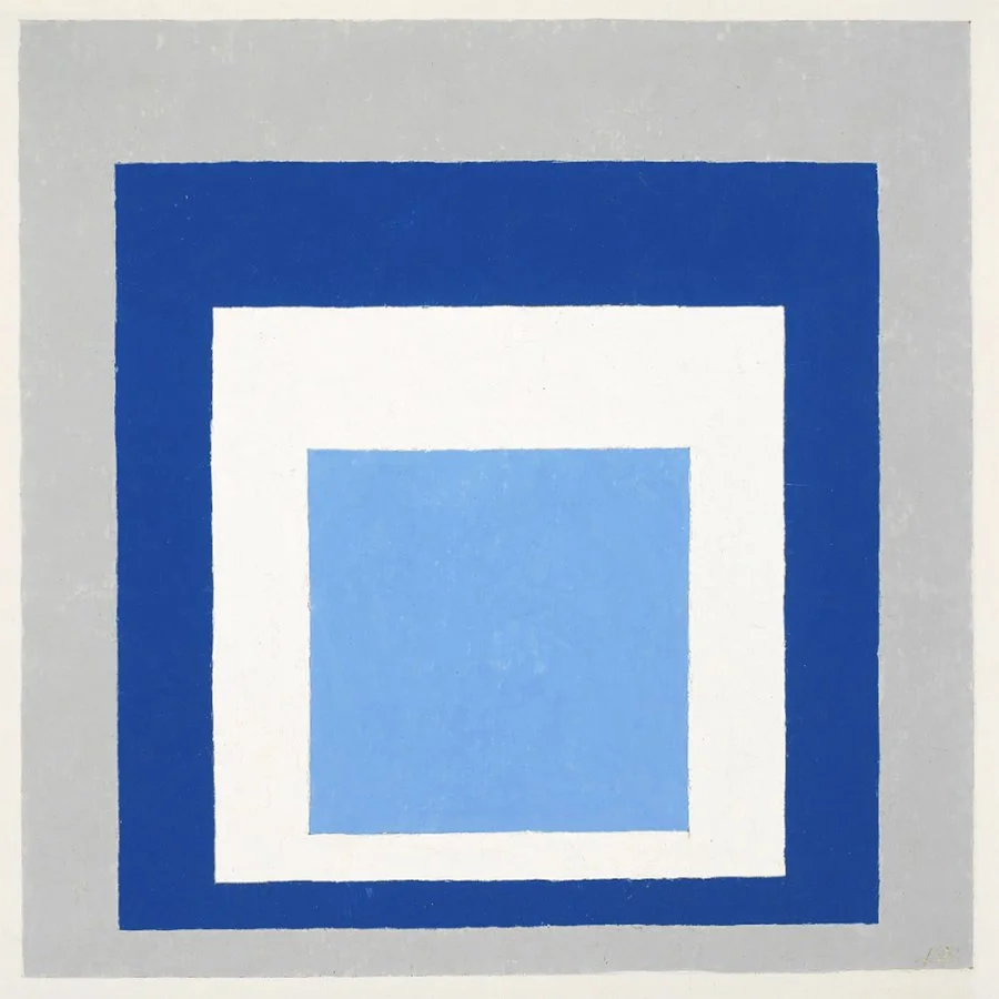
Above: Homage to the square, 1958 - Josef Albers
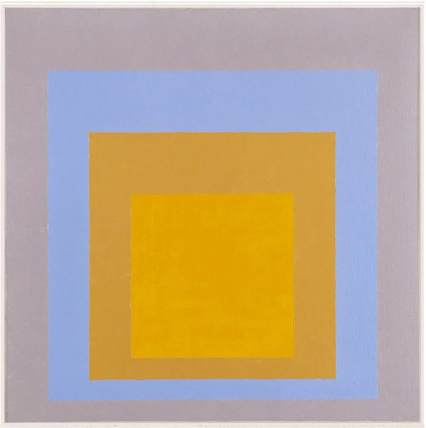
Above: In Wide Light, 1956 - Josef Albers